Content Attributes
A custom plate can look polished or feel cramped before it ever leaves the preview screen. Good results depend on clear lettering, sensible spacing, durable material, and an honest plan for use. Decorative tags, garage signs, gifts, and event pieces each ask for different choices. Buyers who check dimensions, finish, contrast, and local display rules early usually avoid ordering something that looks attractive on screen but is hard to read in daily use.
Start With Purpose
Every successful design starts with function, before color or artwork enters the picture. When weighing tools for Make Your Own License Plate Online, buyers should consider viewing distance, mounting location, sunlight, and weather exposure. Those details shape font size, line count, and background style. A plate meant for a garage wall can carry more personality, while a car display piece benefits from restraint and quick readability.
Check Use Rules
Personalized plates often serve decorative purposes, yet public-road use follows separate rules. Many states limit unofficial tags on registered vehicles, even if the dimensions match a standard frame. Private property, parties, parades, and indoor displays usually allow more creative freedom. A quick review of local guidance helps prevent confusion later. That step also clarifies whether the design should stay simple and neutral, or lean into humor, hobbies, or family identity.
Pick the Right Size
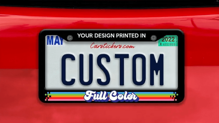
Standard passenger plates usually measure 12 by 6 inches. Motorcycle versions often use 7 by 4 inches, while smaller recreational formats vary. Starting with the right proportions prevents stretched graphics and compressed lettering. Width matters because a phrase that looks balanced on a car tag may feel crowded on a compact panel. Buyers who confirm frame size first usually make cleaner layout choices later in the process.
Keep Text Readable
Readability matters more than decoration. Short wording, generous spacing, and a single focal element usually perform better than dense layouts with several visual ideas competing for attention. Script fonts can look elegant on a mockup, yet fine strokes often blur at a distance. Mixed case frequently improves recognition speed. A simple test helps reduce the preview on a phone screen, step back, and check whether the message remains clear without effort.
Compare Material and Finish
Material affects durability, weight, color retention, and surface stability. Aluminum remains a common choice because it resists rust, stays light, and holds printed detail well. Finish changes appearance in practical ways. Gloss can intensify color, though bright light may cause glare. Matte surfaces soften reflection and often improve legibility outdoors. Buyers should also inspect edge quality, hole placement, and print sharpness, as these details determine whether a piece feels sturdy or flimsy.
Use Strong Contrast
Contrast carries much of the visual work. Dark characters on a light background are easiest to recognise quickly across varied lighting conditions. Pale lettering can work too, though it needs a deep background and uncomplicated font. Busy patterns behind names or numbers reduce legibility almost immediately. Seasonal themes, sports graphics, and flag motifs tend to work best near the border, leaving the center open for the primary message.
Match the Setting
Context should guide tone. A dorm sign, retirement gift, wedding prop, workshop accent, or hobby display each suggests a different mood and text length. Personal names often suit family pieces, while short phrases fit events more naturally. Symbols tied to music, fishing, travel, or farm life can add character without crowding the layout. Designs feel stronger when the setting and message support each other from the start.
Review the Preview
Preview tools help, but they do not catch every issue. Spacing can feel uneven, graphics may sit slightly off center, and mounting holes sometimes interrupt letters. Reading each line aloud often reveals problems faster than silent scanning. Another useful check is viewing the draft at a reduced size, because clutter becomes obvious sooner. One careful proofread can prevent common ordering errors that otherwise lead to disappointment and replacement costs.
Consider Timing
Production times vary, especially near holidays and graduation season. Fast shipping does not always mean a fast overall turnaround if printing, coating, or approval steps add several days. Buyers ordering for a birthday, reunion, or ceremony should leave room for edits and transit delays. Return policies deserve close attention as well, since personalized goods are often a final sale. Delivery timing can matter just as much as the artwork itself.
Conclusion
A strong custom License Plate usually comes from a few disciplined choices rather than extra decoration. Clear text, correct dimensions, durable material, and good contrast do more for visual impact than crowded graphics ever will. Buyers who check the use rules, carefully review the preview, and allow enough lead time tend to achieve better results. That approach keeps the process simple and helps the finished piece look intentional wherever it is displayed.