Content Attributes
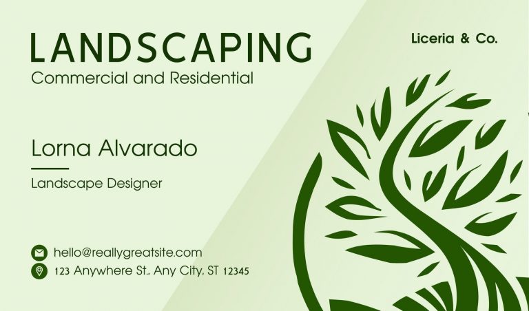
A lawn care company often meets prospects in driveways, garden centers, or after finishing a weekly cut. Those short exchanges shape trust before any quote reaches a kitchen counter. A thin, cluttered card can suggest rushed habits. A clean, sturdy piece points to order, care, and pride. Homeowners read those signals quickly, then connect them with edging precision, arrival times, equipment condition, and how a crew may handle turf, beds, and walkways.
First Impressions Matter
Most people glance at a card for seconds, yet paper weight, spacing, and print clarity register right away. In that brief review, professional lawn care business cards can indicate whether a company values preparation, respects communication, and pays attention to detail. Those clues matter because homeowners often compare several crews, then rely on small visual signs before making a call, sending a text, or requesting an estimate.
Readability Builds Confidence
Clear reading supports trust faster than clever styling. A tiny type, weak contrast, or packed lines create strain and quiet doubt. A prospect should be able to find the company name, phone number, and service area almost instantly. Simple fonts work better than ornate lettering. A strong visual order guides the eye smoothly, making the business feel steady, prepared, and easy to contact.
Stock And Finish Send Signals
Paper stock sends a physical message before anyone studies the text. Thick material feels stable in the hand, while flimsy sheets can seem forgettable. Matte surfaces often suit service companies because they feel clean and restrained. Soft-touch coating can add comfort without flash. Raised print may fit a premium crew if the rest of the layout stays plain and readable.
Layout Reveals Work Habits
Layout often hints at daily work habits. Crowded logos, crooked alignment, and random color blocks suggest loose standards. Balanced spacing points to discipline and routine. Many homeowners connect visual order with route planning, tool storage, and cleanup quality, even if they never say it aloud. That mental shortcut can influence early trust long before a mower touches grass.
Contact Details Need Focus
Contact details should stay focused and useful. A phone number, website, email, and service area usually cover what a homeowner needs. Long lists of every task can dilute the main purpose. Most prospects want a quick path to reach someone reliable. When essential details stand out, response feels easier, and interest is less likely to fade after an in-person conversation.
Local Identity Adds Trust
Local identity can strengthen credibility in a quiet way. A restrained green palette, a seasonal image, or a familiar regional cue helps a card feel rooted nearby. That matters in lawn care because yard conditions change by soil type, rainfall, and grass variety. Homeowners often prefer crews who seem familiar with neighborhood weeds, summer stress, and spring growth patterns.
Consistency Supports Credibility
A business card should match trucks, uniforms, invoices, and door hangers. Shared colors, logo treatment, and tone create a coherent public image. Mixed styles can raise small questions about follow-through. Consistency also improves recall. If a homeowner later sees the same visual identity on a trailer or yard sign, memory returns faster, and trust often grows with it.
Referral Value Still Counts
Referral value still carries weight, regardless of the screen. A neighbor may hand over a card after praising punctuality, trimming, or cleanup. If that piece looks polished and the information reads clearly, the recommendation feels stronger. People like sharing materials that reflect well on their judgment. Printed cards still support word-of-mouth growth in a direct, practical manner.
Common Mistakes Hurt Perception
Several common mistakes weaken perception quickly. Pixelated logos suggest poor preparation. Hard-to-read script slows the eye and creates friction. Blank backs waste room for a brief service list or appointment note. Generic template art can feel disposable. Each flaw may seem small on its own, yet the combined effect hints at shortcuts, and shortcuts rarely reassure a household choosing recurring service.
Quiet Design Often Wins
Quiet design often creates the strongest impression. Clear facts, generous spacing, and a calm layout respect the reader’s time. That restraint usually feels more professional than crowded claims or loud visual effects. A well-judged card suggests that the company is serious, steady, and capable of doing routine work with care, accuracy, and consistent attention across repeated visits.
Conclusion
For a lawn care business, a card is a small object that carries a large message. It can reflect order, pride, clarity, and local awareness before any equipment leaves the trailer. Because homeowners make quick judgments, each design choice matters. Better stock, sharper type, and stronger structure do more than improve appearance. They help a company appear dependable, memorable, and worthy of trust in a crowded neighborhood market.