Content Attributes
Improving your design skills takes a lot of practice and patience. By mastering them step by step, you will make your work of the highest quality design.
Words matter
Designers mainly choose popular and overused fonts, as they have to deal with a high pace of work and clients who do not really believe in the prosperity of their business. This is not to say that this is a bad idea, unless your choice has specific reasons for it. Of course, there are many attractive products that use familiar fonts — Logo, Roboto, or San Francisco — but these choices must always be carefully considered.
Undoubtedly, typography has a special place in user interface design services. Feel free to experiment with different fonts and combinations. Even a relatively small change can affect the overall perception of your designs. Sounds obvious, but always use truthful content.
The devil is in the details
Lack of branding is another reason why design projects look too simple and mundane. This is influenced by many factors. Lack of necessary funds and lack of an idea of what it will look like are the main ones. Not all startups need guidance on building a $150K brand from day one, especially for MVP (minimum viable product), but without some flavor, your projects won’t stand out from the crowd.
What if you don’t have a brand building guide and the client hasn’t expressed their own preferences? First, make sure the font and color scheme matches the product concept. For example, orange or decorative fonts will not work with a doctor’s appointment application. The same can be said for the app for crypto traders. Obviously pastels and serifs will look bad. You can also use the default helper templates and icon sets to create a personal touch.
Ability to adapt
Low contrast is a popular design trend outside of Dribbble. Aesthetics come to the fore and eliminate the possibility of easy reading, which strains eyesight twice as much and repels users from our projects. Incomplete contrast devalues the user experience. Have you ever used your phone outdoors? Of course, this is a rhetorical question, but designers often forget about its meaning.
It’s pretty easy to design for a high-resolution retina display and approve your own designs on a new iPhone in a bright office environment. We often forget that not every user can boast of a gadget of the latest model and not always have the opportunity to use our application indoors. Low-contrast text is almost impossible to read on the street.
Another format to keep in mind is the dark design. The popularity of negative contrast is growing rapidly. This design not only saves battery power, but also contributes to easy readability. Our designs should also adapt to dark color schemes.
Merging the project
Dataart knows that consistency and collaboration with developers is an important part of the workflow. It’s easy to lose sight of all the elements you use in your projects and forget to communicate certain parts of your work. Therefore, you should document the work performed so that it is available to everyone on the team. There are several ways to do this.
Start by documenting all the design symbols used. Make sure each component you use has a different position. Create a page that serves as the only truthful source for your developers when it comes to typography, colors, icons, and grids. This will not only save time, but also help you think of the project as a whole. Constraints can make you more creative than you think.
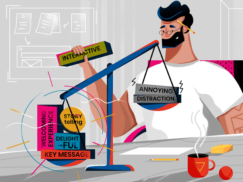
Concentration is also a design skill
We are all humans, not robots. Today, being able to focus on one thing is much more difficult than ever. Constant notifications on your phone and computer turn into bright moments of pseudo-pleasure. In addition, you need to be aware of a variety of UI samples and ideas. The ability to focus on something specific will not only speed up your work, but it will also improve details in projects.
To focus on a specific task, divide your day into small chunks of time, according to which you complete a specific type of task. Think of 2-hour blocks, or experiment with other time frames. You can mark your time in the Google Calendar app or in the built-in calendar on your phone.